the paint colors we can't Design without
Here at THELIFESTYLEDCO we tend to stick to our tried and true few including a lot of neutrals - white for those crisp and modern moments, and black for design moments that command a little more attention. And while we tend to stick to our earthy colored favorites, there are a few standout spaces where we went rogue and LOVED IT!
but first, the basics: Finishes
EGGSHELL
Walls
Trim
Doors
FLAT
CEILING
our favorite crisp whites
To anyone who says white paint is "boring," we're here to convince you otherwise! White paint is our go-to because it creates a clean slate, instantly neutralizes, and is one of the easiest and most cost effective ways to transform any space.
white (dew380) | dunn edwards
Dunn Edwards White is crisp, airy and a great versatile option because it stays true regardless of where it's being used, whether it be walls, ceilings, cabinets or trim.


#75thBuild
Design: THELIFESTYLEDCO | Build: E&S Builders + Modern Splendor Homes | Photography: Nick Sorensen
CHANTILLY LACE (2121-70) | BENJAMIN MOORE
Chantilly Lace has no warm or cool undertones, making it a universal great option when it comes to choosing white paint, especially in spaces with an abundance of natural light.

#maverickdrproj
DESIGN: THELIFESTYLEDCO | PHOTOGRAPHY: NICK SORENSEN

#thegreatlakeproj
DESIGN: THELIFESTYLEDCO | Build: E&S Builders + Modern Splendor Homes | PHOTOGRAPHY: NICK SORENSEN


#CortezBuild
Design: THELIFESTYLEDCO | Build: E&S Builders + Modern Splendor Homes | Photography: Nick Sorensen
SUPER WHITE (OC-152) | BENJAMIN MOORE
Considered to be a "cool" white, Super White by Benjamin Moore brings a sense of clarity with its ultra clean shade.

#sapphirepvproj
DESIGN: THELIFESTYLEDCO | BUILD: E&S BUILDERS + MODERN SPLENDOR HOMES | PHOTOGRAPHY: NICK SORENSEN

#darlingabodeproj
DESIGN: THELIFESTYLEDCO | BUILD: Green Street Custom Homes | PHOTOGRAPHY: Taylor cole
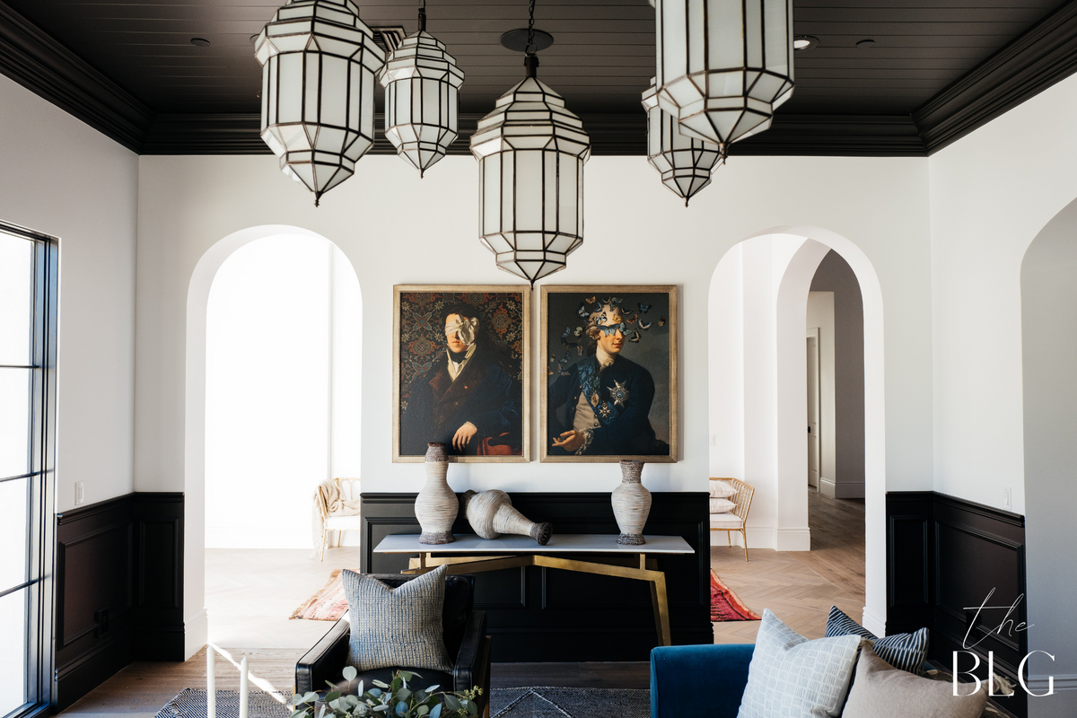
dark and moody
The only paint color we love more than white is BLACK! And while we use it sparingly, we can always depend on it packing a moody punch. Black paint can be intimidating, but aside from adding a bit of drama, it also creates a cool, modern look when contrasted with stark whites.
BLACK BEAUTY (2128-10) | BENJAMIN MOORE
Benjamin Moore's Black Beauty is our one and only for a reason! It's the perfect matte black shade, while still being rich in hue, and we've used it in small and large spaces alike.

#75thbuild
DESIGN: THELIFESTYLEDCO | BUILD: E&S BUILDERS + MODERN SPLENDOR HOMES | PHOTOGRAPHY: NICK SORENSEN

#sapphirepvproj
DESIGN: THELIFESTYLEDCO | BUILD: E&S BUILDERS + MODERN SPLENDOR HOMES | PHOTOGRAPHY: NICK SORENSEN
#sapphirepvproj
DESIGN: THELIFESTYLEDCO | BUILD: E&S BUILDERS + MODERN SPLENDOR HOMES PHOTOGRAPHY: NICK SORENSEN
WROUGHT IRON (2124-10) | BENJAMIN MOORE
Our clients in this project are BIG entertainers, so the vision for their formal dining room was upscale, luxe private dining - think Steak44, Organic Desert Living style! We achieved that look with Wrought Iron by Benjamin Moore, which not only added a cozy vibe, but also that touch of drama our clients' were craving.

#maverickdrproj
DESIGN: THELIFESTYLEDCO | PHOTOGRAPHY: NICK SORENSEN
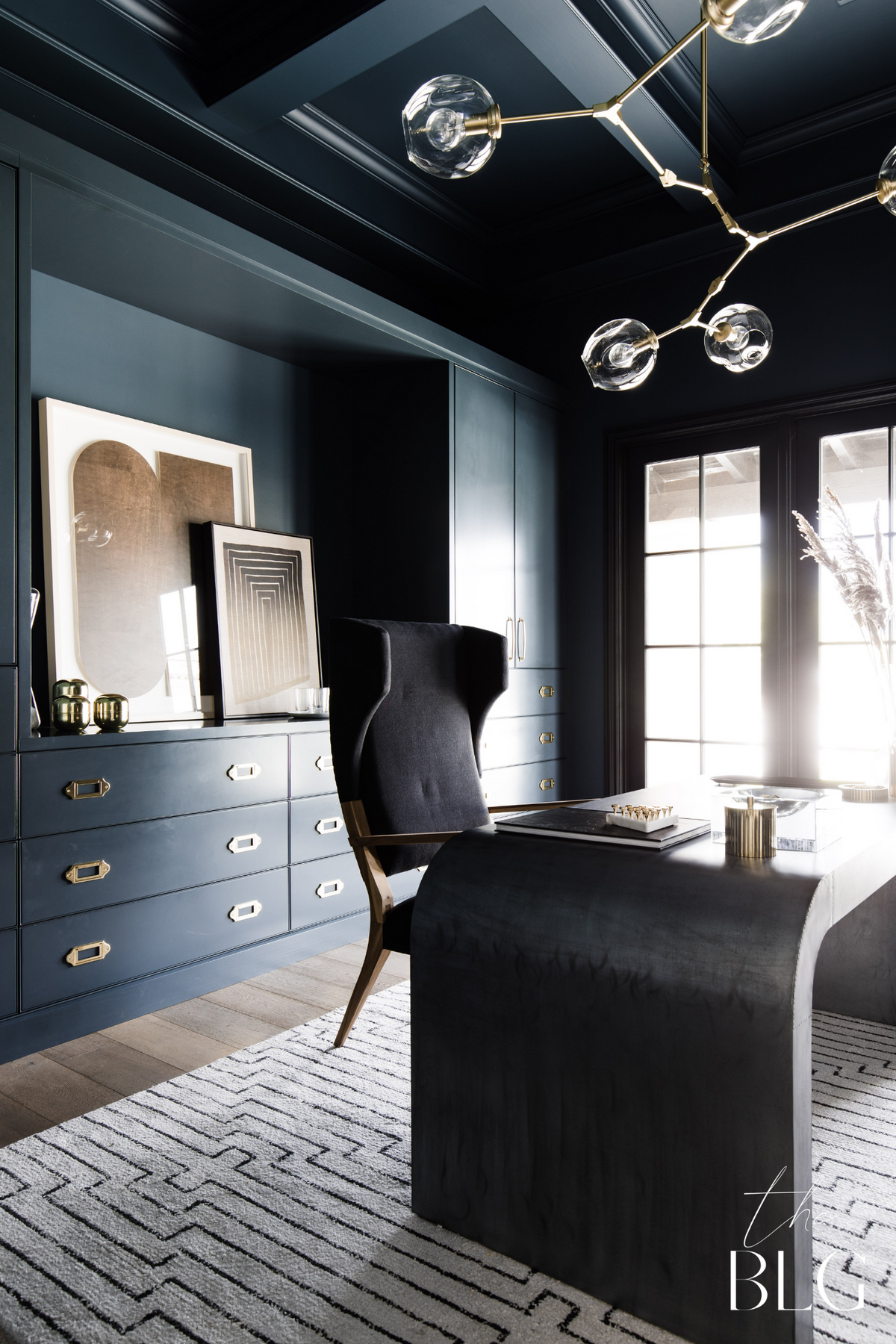
BLACK SABLE (1423) | ICI
Our client was beyond excited to have an office of his own and only had ONE request - make him feel like he was working in a high rise in New York City! We wanted this room to feel elevated and luxe, so we used ICI's Black Sable on the walls, ceiling and trim to create a high class city vibe.

#partyhouseproj
DESIGN: THELIFESTYLEDCO | PHOTOGRAPHY: NICK SORENSEN
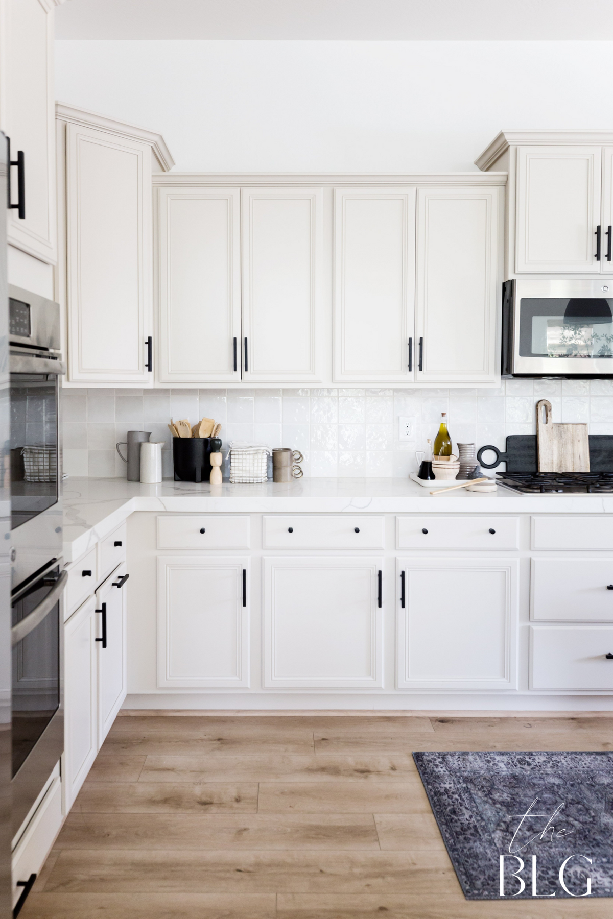
FLINT (AF-560) | BENJAMIN MOORE
One of our most asked questions from our #79thBuild is about the kitchen cabinet color! We wanted to use a balanced blue that paired nicely with the stainless steel appliances and kitchen hardscape. Flint by Benjamin Moore gave this kitchen the moody and earthy touch we were looking for!

#79THBUILD
DESIGN: THELIFESTYLEDCO | BUILD: E&S BUILDERS | PHOTOGRAPHY: NICK SORENSEN
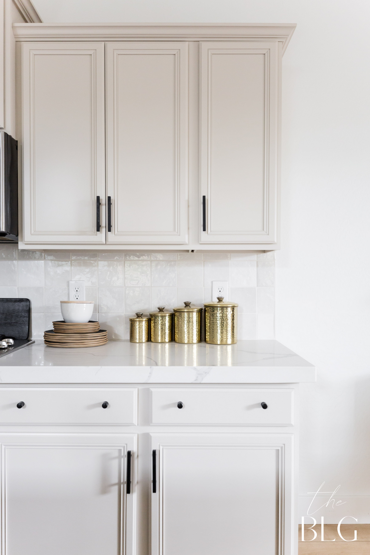
our go-to white cabinet alternative
We believe that you really can't go wrong with white paint! But when it comes to cabinets, we like to take the opportunity to add a little (and when we say a little, we mean it ha!) contrast. Enter your new cabinet color best friend: Accessible Beige by Sherwin Williams!
ACCESSIBLE BEIGE (SW 7036) | SHERWIN WILLIAMS
When it comes to cabinets, it seems we have a type! We fell in love with Accessible Beige by Sherwin Williams because it creates a perfect shade of mushroom/putty that evokes a sense of warmth, while still keeping things looking crisp.

#coolshitproj
DESIGN: THELIFESTYLEDCO | PHOTOGRAPHY: RYAN GARVIN

#MAVERICKDRproj
DESIGN: THELIFESTYLEDCO | PHOTOGRAPHY: NICK SORENSEN

#CALLEEASTPROJ
DESIGN: THELIFESTYLEDCO | PHOTOGRAPHY: STEPHANIE STUDER, LIFECREATED
#sierramadrePROJ
DESIGN: THELIFESTYLEDCO | PHOTOGRAPHY: STEPHANIE STUDER, LIFECREATED
REPOSE GRAY (SW 7015) | SHERWIN WILLIAMS
Like Accessible Beige, Repose Gray, which is also by Sherwin Williams, is a modern alternative to the basic white cabinet. Repose Gray is slightly cooler of a shade compared to Accessible Beige, which is warmer with its taupe undertones.

#thegreatlakeproj
DESIGN: THELIFESTYLEDCO | Build: E&S Builders + Modern Splendor Homes | PHOTOGRAPHY: NICK SORENSEN

#75thbuild
DESIGN: THELIFESTYLEDCO | BUILD: E&S BUILDERS + MODERN SPLENDOR HOMES | PHOTOGRAPHY: NICK SORENSEN
Make a bold statement
Remember when we mentioned we went rogue a few times? Well, these are them and we can't imagine these spaces any differently. The bold color choices just.had.to.HAPPEN! Whenever we stray away from our signature neutral color palette it's always a risk, but what's life without a little thrill right?!
INDIA YELLOW (NO.66) | FARROW AND BALL
Sometimes in design, you need to push the boundaries. In the words of Kristen Forgione, our very own Principal Designer, "We took a HUGE risk with this cabinet color. One everyone else was too scared to take. One the cabinet people told us we were crazy for and checked the color not once, but twice. One I was ready to have to pay for should the vision not match the outcome. One we sampled and sampled and sampled again and prayed the color would turn out in the 'it' color we all know mustard is at the moment, and not like baby poop. We’ve been on pins and needles for months waiting and now they are in and they are everything we thought they’d be and more!"


#75thbuild
DESIGN: THELIFESTYLEDCO | BUILD: E&S BUILDERS + MODERN SPLENDOR HOMES | PHOTOGRAPHY: NICK SORENSEN